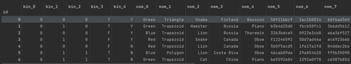
[PYTHON - 머신러닝_캐글_실습-01]범주형 데이터 이진분류★subplots 활용할 수 있는 gridspec★ax.patches★교차표(crosstab)★plt.grid(visible=False)★CategoricalDtype()★
1. 분류 문제
==>분류 문제에는 타깃값(종속변수)를 예측할 수도 있고, 타깃값일 확률을 예측할 수 도 있다.
==> 타깃값이 0 이나 1 이냐가 아닌 1일 확률을 예측한다.

==> 이번 문제의 목표는 각 테스트 데이터의 타깃값이 1일 확률을 예측하는 것이다.
2. 데이터 파악
def resumetable(df):
    print(f'데이터셋 형상 : {df.shape}')
    summary = pd.DataFrame(df.dtypes , columns = ['데이터 타입'])
    summary = summary.reset_index()
    summary = summary.rename(columns = {'index' : '피처'})
    summary['결측값 개수'] = df.isnull().sum().values
    summary['고윳값 개수'] = df.nunique().values
    summary['첫 번째 값'] = df.loc[0].values
    summary['두 번째 값'] = df.loc[1].values
    summary['세 번째 값'] = df.loc[2].values


    return summary

resumetable(train)
1. 이진 (binary) 피처 : bin_0 ~ bin_4 ==> 고윳값 개수가 2개씩 ==> 이진 피처이다. ==> bin_0~ 2 은 데이터타입이 int로써, 실제값이 0또는 1로 구성되어있다.
==> bin_3~ 4 는 데이터타입이 object로써, 실제값이 T또는 F , Y또는 N이다.
2. 명목형(nominal) 피처 : nom_0 ~ nom_9 ==> 명목형 피처는 모두 object 타입이고, 결측값은 없다.
3. 순서형(ordinal) 피처 : ord_0 ~ ord_5
for i in range(3):
    feature = 'ord_' + str(i)
    print(f'{feature} 고윳값 : {train[feature].unique()}')
# 순서형 데이터들의 고윳값 출력
ord_0 고윳값 : [2 1 3]
ord_1 고윳값 : ['Grandmaster' 'Expert' 'Novice' 'Contributor' 'Master']
ord_2 고윳값 : ['Cold' 'Hot' 'Lava Hot' 'Boiling Hot' 'Freezing' 'Warm']
==> 원 핫 인코딩시 참고 사항
for i in range(3,6):
    feature = 'ord_' + str(i)
    print(f'{feature} 고윳값 : {train[feature].unique()}')
ord_3 고윳값 : ['h' 'a' 'i' 'j' 'g' 'e' 'd' 'b' 'k' 'f' 'l' 'n' 'o' 'c' 'm']
ord_4 고윳값 : ['D' 'A' 'R' 'E' 'P' 'K' 'V' 'Q' 'Z' 'L' 'F' 'T' 'U' 'S' 'Y' 'B' 'H' 'J'
'N' 'G' 'W' 'I' 'O' 'C' 'X' 'M']
ord_5 고윳값 : ['kr' 'bF' 'Jc' 'kW' 'qP' 'PZ' 'wy' 'Ed' 'qo' 'CZ' 'qX' 'su' 'dP' 'aP'
··········]
==> 원 핫 인코딩시 참고 사항
4. 그 외 피처 : day , month , target
print('day 고윳값 : ',train['day'].unique())
print('month 고윳값 :' , train['month'].unique())
print('target 고윳값 : ', train['target'].unique())
day 고윳값 : [2 7 5 4 3 1 6]
month 고윳값 : [ 2 8 1 4 10 3 7 9 12 11 5 6]
target 고윳값 : [0 1]
3. 데이터 시각화
import seaborn as sns
import matplotlib as mpl
import matplotlib.pyplot as plt
%matplotlib inline
1. 타깃값 분포
def write_percent(ax , total_size):
    # 도형 객체를 순회하며 막대 상단에 타깃값 비율 표시
    for patch in ax.patches:
        height = patch.get_height() # 도형 높이(데이터 개수)
        width = patch.get_width() # 도형 넓이
        left_coord = patch.get_x() # 도형 왼쪽 테두리의 x축 위치
        percent = height/total_size*100 # 타깃값 비율

        # (x,y) 좌표에 텍스트 입력
        ax.text(x=left_coord + width/2.0 , y = height + total_size*0.001,
                s = f'{percent : 1.1f}%', ha= 'center')
plt.figure(figsize=(7,6))

ax = sns.countplot(x='target' , data = train)
write_percent(ax , len(train)) # 비율 표시
ax.set_title('Target Distribution')
==> 타깃값의 불균형을 파악하여 부족한 타깃값에 더 집중해 모델링을 수행할 수 있다.
2. 이진 피처 분포
import matplotlib.gridspec as gridspec # 여러 그래프를 격자 형태로 배치

# 3행 2열
mpl.rc('font' , size = 12)
grid = gridspec.GridSpec(3,2) # 그래프(서브플롯)을 3행 2열로 배치
plt.figure(figsize=(10,16)) # 전체 Figure 크기 설정
plt.subplots_adjust(wspace= 0.4 , hspace= 0.3) # 서브플롯 간 좌우/상하 여백 설정

# 서브플롯 그리기
bin_features = ['bin_0' , 'bin_1' , 'bin_2' , 'bin_3', 'bin_4'] # 피처 목록

for idx, feature in enumerate(bin_features) :
    ax = plt.subplot(grid[idx])

    # ax 축에 타깃값 분포 카운트플롯 그리기
    sns.countplot(x=feature , data = train , hue = 'target' , palette = 'pastel' , ax= ax)
    # hue는 세부적으로 나눠 그릴 기준 피처, 여기서는 타깃값(target)을 전달했다.
    ax.set_title(f'{feature} Distribution by Target') # 그래프 제목 설정
    write_percent(ax, len(train))
==> bin_4 : 값이 Y인 데이터 중에서 target 값이 0인 데이터와 1인 데이터를 나누어 표시
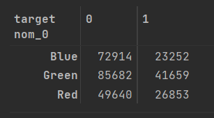
3. 명목형 피처 분포
==> 명목형 피처 분포와 명목형 피처별 타깃값 1의 비율 살펴보기
pd.crosstab(train['nom_0'] , train['target'])==> 교차표(cross-tabulation) 혹은 교차분석표는 범주형 데이터 2개를 비교 분석하는 데 사용되는 표로, 각 범주형 데이터의 빈도나 통계량을 행과 열로 결합해놓은 표를 말한다.
==> 교차분석표를 만드는 이유는 명목형 피처별 타깃값 1 비율을 구하기 위해서이다.
crosstab = pd.crosstab(train['nom_0'] , train['target'] , normalize= 'index') * 100
# 열을 기준으로 정규화하려면 normalize = 'columns'로 설정해 실행하면 된다.
# 정규화한 값(비율) 구하기.
crosstab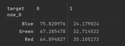
def get_crosstab(df , feature):
    crosstab = pd.crosstab(df[feature] , df['target'] , normalize='index') * 100
    crosstab = crosstab.reset_index()
    return crosstab

crosstab = get_crosstab(train, 'nom_0')
crosstab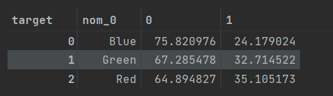
def plot_pointplot(ax , feature , crosstab):
    ax2 = ax.twinx() # x축은 공유하고 y축은 공유하지 않는 새로운 축 생성
    # 새로운 축에 포인트플롯 그리기
    ax2 = sns.pointplot(x=feature , y =1 , data=crosstab ,
                        order = crosstab[feature].values , color = 'black' , legend = True)
    ax2.set_ylim(crosstab[1].min()- 5 , crosstab[1].max()*1.1) # y축 범위 설정
    ax2.set_ylabel('Target 1 Ratio(%)')
==> plot_pointplot()은 이미 카운트플롯이 그려진 축에 포인트플롯을 중복으로 그린다.
==> x축을 두 그래프가 공유한다.
def plot_cat_dist_with_true_ratio(df, features , num_rows , num_cols , size = (15,20) ):

    plt.figure(figsize = size) # 전체 Figure 크기 설정
    grid = gridspec.GridSpec(num_rows , num_cols) # 서브플롯 배치
    plt.subplots_adjust(wspace = 0.45 , hspace= 0.3) # 서브플롯 좌우/상하 여백 설정

    for idx ,feature in enumerate(features):
        ax = plt.subplot(grid[idx])
        # ax.set_xticks([])
        # ax.set_yticks([])
        crosstab = get_crosstab(df, feature) # 교차분석표 생성

        # ax 축에 타깃값 분포 카운트플롯 그리기


        sns.countplot(x = feature , data = df , order = crosstab[feature].values,
                      color = 'skyblue' , ax = ax)
        plt.grid(visible=False)
        write_percent(ax , len(df)) # 비율 표시

        plot_pointplot(ax , feature , crosstab) # 포인트플롯 그리기
        plt.grid(visible=False)
        ax.set_title(f'{feature} Distribution') # 그래프 제목 설정

# ==> 이 함수는 인수로 받는 features 피처마다 타깃값별로 분포도를 그린다.
==> plt.grid(visible = False) 로 뒤에 그리드들 삭제하였다.
nom_features = ['nom_0', 'nom_1' , 'nom_2' , 'nom_3' ,'nom_4'] # 명목형 피처
plot_cat_dist_with_true_ratio(train , nom_features , num_rows= 3 , num_cols=2)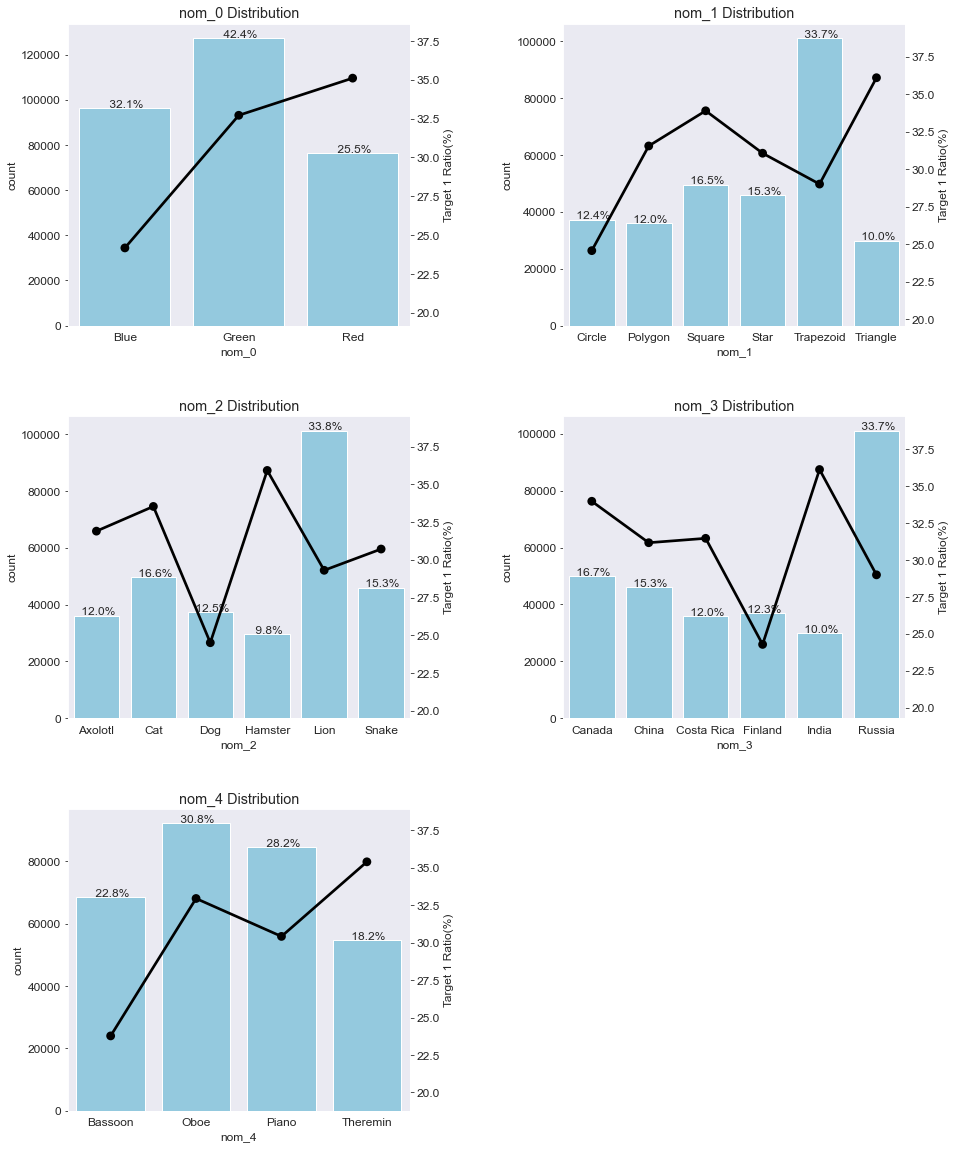
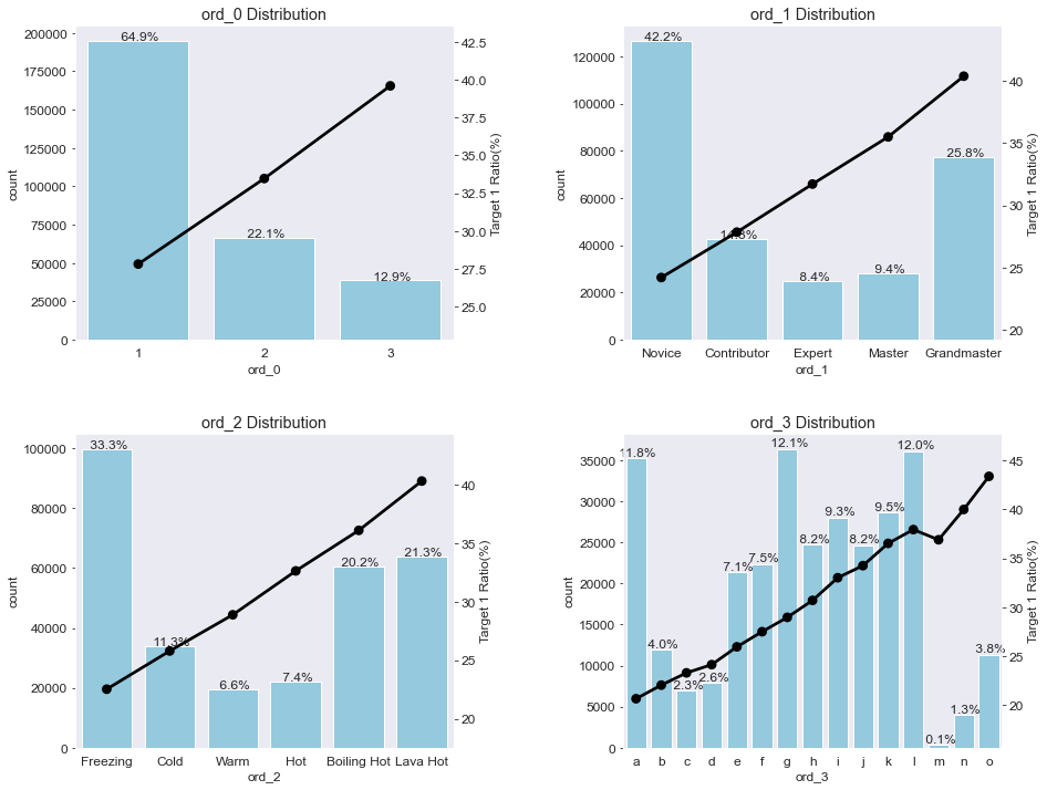
4. 순서형 피처 분포
ord_features = ['ord_0' , 'ord_1' , 'ord_2' , 'ord_3'] # 순서형 피처
plot_cat_dist_with_true_ratio(train , ord_features , num_rows=2 , num_cols=2 , size=(15,12))
from pandas.api.types import CategoricalDtype

ord_1_value = ['Novice' , 'Contributor' , 'Expert' , 'Master' , 'Grandmaster']
ord_2_value = ['Freezing' , 'Cold' , 'Warm' , 'Hot' , 'Boiling Hot' , 'Lava Hot']

# 순서를 지정한 범주형 데이터 타입

ord_1_dtype = CategoricalDtype(categories = ord_1_value , ordered = True)
ord_2_dtype = CategoricalDtype(categories = ord_2_value , ordered= True)
#categories:  범주형 데이터 타입으로 인코딩할 값 목록

# 데이터 타입 변경

train['ord_1'] = train['ord_1'].astype(ord_1_dtype)
train['ord_2'] = train['ord_2'].astype(ord_2_dtype)


train.dtypes
==> CategoricalDtype()을 적용하여 피처 자체의 순서를 지정한다.
plot_cat_dist_with_true_ratio(train , ord_features , num_rows=2 , num_cols=2 , size=(15,12))
==> ord_0은 숫자 크기 순으로, ord_1 과 ord_2 는 지정된 순서대로, ord_3는 알파벳 순으로 정렬됐다.
==> 이 결과로부터 고윳값 순서에 따라 타깃값 1 비율도 비례해서 커진다는 것을 확인할 수 있다.

4. 날짜형 피처 분포
date_features = ['day' , 'month']
plot_cat_dist_with_true_ratio(train , date_features , num_rows= 2,  num_cols= 1 , size=(10,10))

# day 피처는 7개인 걸로 보아 요일을 의미한다고 추측할 수 있다.
# 1에서 4로 갈수록 타깃값 1 비율이 줄어들고, 4에서 7로 갈 수록 비율이 늘어난다.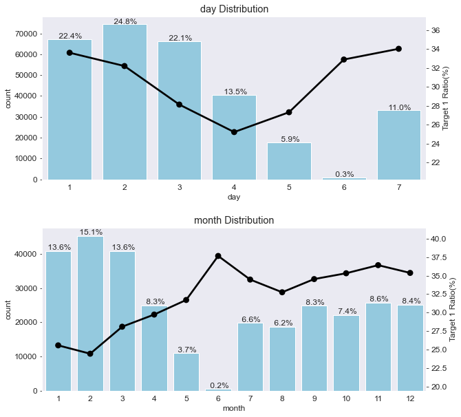
출처 : 머신러닝·딥러닝 문제해결 전략
(Golden Rabbit , 저자 : 신백균)
※혼자 공부용