[회귀-예측]Prediction of Wild Blueberry Yield★XGBoost, LightGBM 활용-01-EDA
1. EDA 처리_ 데이터 파악
import pandas as pd

data_path = '../blue_berry/'

train = pd.read_csv(data_path + 'train.csv' , index_col = 'id')
test = pd.read_csv(data_path + 'test.csv' , index_col = 'id')
submission = pd.read_csv(data_path + 'sample_submission.csv' , index_col= 'id')
train
train.info()
==> 15289행 , NULL 값이 없고 , 모두가 float64 형이다!
import seaborn as sns
import matplotlib.pyplot as plt

# 피처 개수 설정
num_features = 16

# 박스플롯 그리드 생성
fig, axes = plt.subplots(nrows=num_features // 4, ncols=4, figsize=(12, 12))

# 각 피처별 박스플롯 그리기
for i, col in enumerate(train.columns[:num_features]):
    ax = axes[i // 4, i % 4]  # 서브플롯 위치 설정
    sns.boxplot(x=train[col], ax=ax)  # 박스플롯 그리기
    ax.set_title(col)  # 서브플롯 제목 설정

plt.tight_layout()  # 서브플롯 간격 조정
plt.show()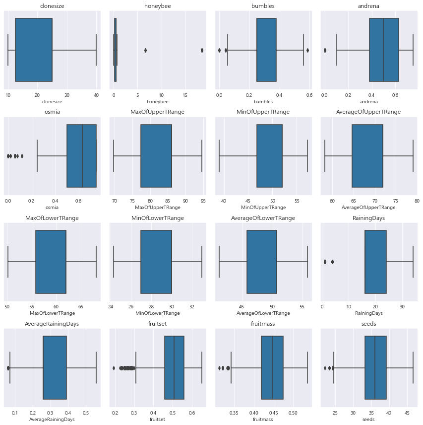
==> 'osima' , 'fruitset' , 'fruitmass' , 'seeds' . 'RainingDays' 에 이상치가 존재한다.
test.info()
==> 10194 행 , NULL 값이 없다!
2. EDA 처리_ 데이터 상관관계 분석
corrMat = train[train.columns.tolist()[:-1]].corr()
corrMat
fig,ax = plt.subplots()
fig.set_size_inches(15,15)
sns.heatmap(corrMat , annot =True )
ax.set(title='Heatmap of Numerical Data')
==> 피처별 상관관계 시각화 하였을때 , 0.9가 넘는 것들이 눈에 보인다 ==> 상관관계가 쎄면은 차원축소로 변수를 줄이는 것도 좋다!
3. EDA 처리_ 데이터 합쳐보기
all_data = pd.concat([train,test]) # 훈련 데이터와 테스트 데이터 합치기
# all_data = all_data.drop('Survived' , axis = 1) # 타깃값 제거
all_data
all_data = all_data.drop('yield' , axis = 1) # 타깃값 제거
all_data
==> 25483행 , 16열 ==> yield값 제외 시켰다
4. EDA 처리_ 데이터 형식 알아보기
import matplotlib.pyplot as plt
import seaborn as sns
from scipy.stats import norm
import matplotlib.pyplot as plt

# 서브플롯을 생성할 크기 설정
plt.figure(figsize=(12, 8))
# sns.countplot(x='clonesize', hue='yield', data=train)
# 피처들의 리스트
features = all_data.columns.tolist()

# 피처들에 대한 countplot 그리기
for i, feature in enumerate(features):
    plt.subplot(4, 4, i+1)
    sns.histplot(all_data[feature], kde=True, stat='density', color='skyblue', alpha=0.7)
    mu, std = norm.fit(all_data[feature].dropna())
    xmin, xmax = plt.xlim()
    x = np.linspace(xmin, xmax, 100)
    p = norm.pdf(x, mu, std)
    plt.plot(x, p, 'r', linewidth=2)
    plt.title(f'Features distribution (mu={mu:.2f}, std={std:.2f})')
    plt.title(f'{feature} - Survived Countplot')

# 레이아웃 조정
plt.tight_layout()

# 그래프 출력
plt.show()

# [fruitset , fruitmass ,seeds]
https://knowallworld.tistory.com/253
stats.norm.cdf()★표준정규분포 넓이 구하기!!★ax.lineplot★정규분포(Normal Distribution)★기초통계학-[Ch
1. 정규분포(Normal Distribution) ==> 자료 집단에 대한 도수히스토그램은 자료의 수가 많을 수록 종 모양에 가까운 형태로 나타난다. ==> 종 모양의 확률분포를 정규분포라고 한다. 1>정규분포의 성질
knowallworld.tistory.com
https://knowallworld.tistory.com/216
★distplot , histplot , twinx(), ticker , axvline()★정규분포 그래프★기초통계학-[Chapter03 - 05]
1. A 데이터프레임 생성 A='30.74 28.44 30.20 32.67 33.29 31.06 30.08 30.62 27.31 27.88 ' \ '26.03 29.93 31.63 28.13 30.62 27.80 28.69 28.14 31.62 30.61 ' \ '27.95 31.62 29.37 30.61 31.80 29.32 29.92 31.97 30.39 29.14 ' \ '30.14 31.54 31.03 28.52 28.
knowallworld.tistory.com
==> histplot()에 대한 설명
==> 피쳐별로 보았을때, [fruitset , fruitmass ,seeds] ==> 이 3개만이 연속형 변수라고 볼 수 있다.
==> 나머지 피처들은 명목형(범주형) 변수라고 생각하자! ==> 추후 PCA 혹은 MCA 할시 활용이 가능하다!
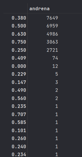
all_data['andrena'].value_counts()