★zip, collections.Counter()★도수표, 도수막대그래프★Plt, Fig, Seaborn 이해[Python]★기초통계학-[Chapter02 - 연습문제]
2022. 11. 30. 16:19
728x90
반응형
P46
고객 50명 대상으로 만족도 조사
GASAAIPIIGASSGPASSISPIPPPGASPIGIAGGSPASGPIAAGSSGGS==> 50명의 고객
1. 도수표 그리기
c = 'GASAAIPIIGASSGPASSISPIPPPGASPIGIAGGSPASGPIAAGSSGGS'
d = []
for i in c:
    d.append(i)
d
d = ['G', 'A','S', ·······················]
1. 리스트 데이터 프레임화 (zip , collections.Counter() 활용!)
import collections
hashes = collections.Counter(d) #hash로 처리하여 갯수 셀때 유용해진다.
x = list(hashes.keys())
y = list(hashes.values())
print(x)
print(y)
print(list(zip(x,y))) #zip은 각 index 별로 묶어준다.
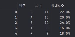
c = pd.DataFrame(zip(x,y) , columns = ['범주' , '도수'])
cx = ['G', 'A', 'S', 'I', 'P']
y = [11, 10, 12, 8, 9]
list(zip(x,y)) = [('G', 11), ('A', 10), ('S', 12), ('I', 8), ('P', 9)]
==>zip은 index 별로 묶어준다.
2. 도수표의 상대도수 구하기
ratio = [round(i/sum(y) ,3)*100 for i in y]
c['상대도수'] = pd.Series(ratio)
c['상대도수'] = c['상대도수'].astype(str) +'%'
c
==> 뒤에 '%' 붙일때 STR으로 형 변환 시키고 해야한다!
2. 도수막대그래프 그리기
※Seaborn은 Matplotlib을 기반으로 다양한 색상 테마와 통계용 차트 등의 기능을 추가한 시각화 패키지이다. 기본적인 시각화 기능은 Matplotlib 패키지에 의존하며 통계 기능은 Statsmodels 패키지에 의존
import platform
import matplotlib
import pandas as pd
import matplotlib.pyplot as plt
from matplotlib import font_manager, rc
import seaborn as sns
%precision 3
from matplotlib import pyplot as plt
%matplotlib inline
#그래프를 주피터 놋북에 그리기 위해
import numpy as np
import copy

from scipy.stats import probplot
from scipy import stats
#히스토그램 그리기
# Window
if platform.system() == 'Windows':
    matplotlib.rc('font', family='Malgun Gothic')
elif platform.system() == 'Darwin': # Mac
    matplotlib.rc('font', family='AppleGothic')
else: #linux
    matplotlib.rc('font', family='NanumGothic')

# 그래프에 마이너스 표시가 되도록 변경
matplotlib.rcParams['axes.unicode_minus'] = False

# 한글 폰트 설정
font_location = 'C:/Windows/Fonts/MALGUNSL.TTF' #맑은고딕
font_name = font_manager.FontProperties(fname=font_location).get_name()
rc('font',family=font_name)
1. Matplotlib 활용(bar() )
fig = plt.figure(figsize=(8,8)) #fig는 도화지
fig.set_facecolor('white') #fig의 배경색

plt.bar(x,y)
plt.title('고객별 만족도 조사')
plt.xlabel('범주' , rotation = 0 , fontsize = 15)
plt.ylabel('도수' , rotation = 0, fontsize = 15)
plt.xticks(rotation=0, fontsize=15) #xticks는 고객 명
2. Seaborn 활용(barplot() )
fig = plt.figure(figsize=(8,8)) #fig는 도화지
fig.set_facecolor('white') #fig의 배경색

ax = sns.barplot(x=c['범주'], y= c['도수'])
ax.set_title('고객별 만족도 조사')
ax.set_xlabel('범주' , rotation = 0 , fontsize = 15)
ax.set_ylabel('도수' , rotation = 0, fontsize = 15)
ax.set_xticklabels(x,rotation=0, fontsize=15) #xticks는 고객 명
3. 선그래프 그리기
1. Matplotlib 활용(Plot() )
fig = plt.figure(figsize=(8,8)) #plt는 matplotlib의 약자
fig.set_facecolor('white')

plt.plot(x,y)
plt.title('고객별 만족도 조사')
plt.xlabel('범주' , rotation = 0 , fontsize = 20)
plt.ylabel('도수' , rotation = 0, fontsize = 20)
plt.xticks(rotation=0, fontsize=20) #xticks는 고객 명
2. Seaborn 활용(lineplot() )
fig = plt.figure(figsize=(8,8)) #plt는 matplotlib의 약자
fig.set_facecolor('white')

ax = sns.lineplot(x=x, y=y,
             color='r', # 색상
             linestyle='-', # 라인 스타일
             marker='o') # 마커
#ax 변수에 저장
ax.set_title('고객별 만족도 조사')
ax.set_xlabel('범주', fontsize = 15 , fontweight = 'bold')
ax.set_ylabel('업무량' , fontsize = 15 , fontweight = 'bold' , rotation = 0 , labelpad=25)
ax.set_xticklabels(x, fontsize=15) #set_xticklabels(축별 이름 , font 크기)| Matplotlib | Seaborn |
| plt.title | sns.set_title |
| plt.xlabel() | sns.set_xlabel() |
| plt.xticks | sns.set_xticklabels() |

4. 상대도수막대그래프 그리기(위에 값 붙이기)
fig = plt.figure(figsize=(8,8)) #fig는 도화지
fig.set_facecolor('white') #fig의 배경색

ax = sns.barplot(x=c['범주'], y= c['상대도수'])
ax.set_title('고객별 만족도 조사')
ax.set_xlabel('범주' , rotation = 0 , fontsize = 15)
ax.set_ylabel('상대도수' , rotation = 0, fontsize = 15 , labelpad= 20)
ax.set_xticklabels(x,rotation=0, fontsize=15) #xticks는 고객 명

for i,txt in enumerate(c['상대도수']):
    b = int(txt)
    if  b == max(c['상대도수']):
        ax.text(i, b+0.4, str(txt)+'%' , ha='center' , color = 'red' , fontweight = 'bold' , fontsize=17)
        #어디 막대, 막대기의 위쪽에
    else:
        ax.text(i, b+0.5, str(txt)+'%' , ha='center' , color = 'dimgray' , fontsize=13 , fontweight = 'bold')
5. 상대도수 선그래프 그리기
fig = plt.figure(figsize=(8,8)) #plt는 matplotlib의 약자
fig.set_facecolor('white')

ax = sns.lineplot(x=x, y=c['상대도수'],
                  color='r', # 색상
                  linestyle='-', # 라인 스타일
                  marker='o') # 마커
#ax 변수에 저장
ax.set_title('고객별 만족도 조사')
ax.set_xlabel('범주', fontsize = 15 , fontweight = 'bold')
ax.set_ylabel('상대도수' , fontsize = 15 , fontweight = 'bold' , rotation = 0 , labelpad=25)
ax.set_xticklabels(x, fontsize=15) #set_xticklabels(축별 이름 , font 크기)
6. 원 그래프(Pie 그래프 그리기)
fig = plt.figure(figsize=(8,8))
fig.set_facecolor('white')

colors = sns.color_palette('bright')[0:5]

plt.pie(c.loc[:,'도수'] , labels=c.loc[:,'범주'], labeldistance=1.2, autopct='%.1f%%' ,textprops={'fontsize' : 15})
출처 : [쉽게 배우는 생활속의 통계학] [북스힐 , 이재원]
※혼자 공부 정리용
728x90
반응형
'기초통계 > 막대그래프,히스토그램' 카테고리의 다른 글
| ★Pie Chart[Python]★기초통계학-[Chapter02 - 연습문제_03] (0) | 2022.12.01 |
|---|---|
| Plt, Fig, Seaborn 이해[Python]★기초통계학-[Chapter02 - 연습문제_02] (0) | 2022.11.30 |
| ★산점도 그래프★이변량 양적자료★기초통계학-[Chapter02 - 03] (0) | 2022.11.30 |
| ★양적자료의 요약★점도표, 도수분포표 , 특이점,계급 , 계급의 수★도수히스토그램★기초통계학-[Chapter02 - 02] (0) | 2022.11.29 |
| ★질적자료의 요약★seaborn, matplotlib★기초통계학-[Chapter02 - 01] (0) | 2022.11.29 |